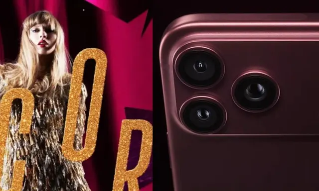
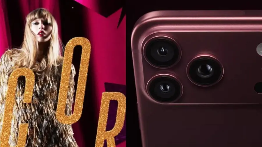
A fascinating theory has emerged that has caught the attention of both Apple fans and Taylor Swift enthusiasts. It suggests that the colors of iPhones released by Apple often bear a striking resemblance to the color palettes used in Taylor Swift's album art.
Coincidences or Intentional Choices?
This theory, which initially seemed lighthearted, has sparked curiosity among fans as similar color associations have occurred repeatedly. The question arises: Is there a deliberate correlation between Apple’s color choices and Taylor Swift’s artistic direction?
Recent Developments Fuel Discussion
The theory gained traction once again after Taylor Swift unveiled her latest project, The Life of a Showgirl: The Encore. The promotional materials prominently featured deep red hues that closely align with one of the new iPhone colors, further igniting discussions among fans.
A History of Color Similarities
This isn’t the first time such similarities have been noted. Over the years, Apple’s iPhone colors have often coincided with the color schemes of Taylor Swift’s various music eras. For instance, during the release of her Midnights album, which is synonymous with deep blue tones, Apple also showcased iPhones in similar shades.
Additionally, the 1989 (Taylor's Version) album is characterized by soft blue colors, which can also be seen in Apple’s iPhone lineup. Even during the aesthetic of The Tortured Poets Department, featuring monochrome shades of white, gray, and black, Apple released iPhones that reflected these neutral tones.
Are They Following the Same Trends?
As the discussion surrounding the Apple-Taylor Swift color theory gains momentum, it is essential to note that there is currently no substantial evidence to suggest a collaboration between Apple and Swift regarding color choices. A more plausible explanation might be that both parties are simply tapping into the same global design and color trends.
Both Apple and Taylor Swift's creative teams draw inspiration from various sources, including fashion trends, graphic design, and pop culture. This shared influence could lead to similar aesthetics appearing in their respective works.
A Long-Standing Relationship
The relationship between Taylor Swift and Apple is noteworthy. Back in 2015, Swift publicly criticized Apple Music for its policy of not compensating artists during its free trial period, prompting the company to change its policy. Since then, their relationship has improved significantly, with Swift even featuring in several Apple Music advertisements.
This history adds an intriguing layer to the theory of a color connection, making it more compelling for fans, even if no direct collaboration on color choices has been proven.
At present, the similarities in color palettes can be regarded as a fan theory and a design coincidence. However, if this pattern continues with future iPhone models and Taylor Swift’s upcoming albums, the theory may become increasingly difficult to dismiss.
Source: https://inet.detik.com/consumer/d-8681036/warna-iphone-selalu-cocok-dengan-album-taylor-swift-kebetulan