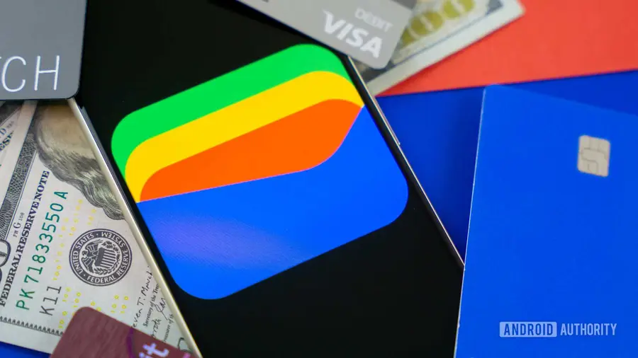
Google Wallet is undergoing a significant transformation with its newly redesigned card interface, which is now being made available to a wider audience. Initially limited to a select group of users, the updated design is now appearing on Pixel smartphones, indicating a broader rollout by Google.
Enhanced Card Display
The most notable improvement in the redesign is the way saved payment cards are presented. Users will now find that their debit and credit cards are displayed in a vertical stack rather than the previous horizontally scrolling carousel. This change makes it easier for users to view and select their desired card with just a tap, eliminating the frustration of endless swiping.
Clutter-Free Main Screen
In addition to the new card layout, Google has kept the main Wallet screen streamlined. The stacked card interface operates separately, which means that other important Wallet features, such as transit cards, loyalty cards, and passes, remain easily accessible from the main screen. This thoughtful design choice aims to enhance user experience by reducing clutter.
Wider Availability Signals Ongoing Rollout
When the redesign was first detected, it was only visible to a small subset of users. However, the recent appearance of the new layout on more devices indicates that Google is actively expanding access to this updated feature. This rollout aligns with Google's ongoing efforts to improve its services and user satisfaction.
Conclusion
The redesigned Google Wallet card interface promises to make managing payment options more intuitive and user-friendly. As the rollout continues, users can expect a smoother experience while navigating their digital wallets.
Source: https://www.androidauthority.com/google-walet-cards-redesign-3719862/